
Understanding what your subscribers are watching, where they are watching them and how they are consuming this content. Content Insights helps you understand the difference in viewing patterns between the living room 10 ft experience to the OTT device experience. These insights can drive your content licensing strategy for different devices and enable you to be more strategic about your license spend. Another key area where Content Insights can drive more value is to understand the viewing habits and preferences of your high ARPU segments to identify opportunities for upsell, and to ensure that the right kind of content is acquired to meet the needs of this segment. Viewing history and viewing statistics are key to having a data driven content procurement strategy.
The Content Insights application comprises of four sheets that focus on different analysis areas:
Summary
Reach
Trends
Value
The Summary sheet is introduced into Content Insights to provide you with a quick look at the key KPI’s against Reach (number of households and devices) and Engagement (viewing minutes across different session types) for the last day, last week and last month. Filters: All the metrics can be filtered using the common filters except for Monthly Active User Graph.
Time Period (Last 1 Day, Last 30 days, Last 7 days, This month) - Default selection is 1 Day
Country – Default selection is All
Cohort - Devices that are activated in a specific month. For example: If 100 devices are activated in January 2025, on selecting January in Cohort filter, the dashboard displays data from all those devices for the month of Jan 2025; default selection is All.
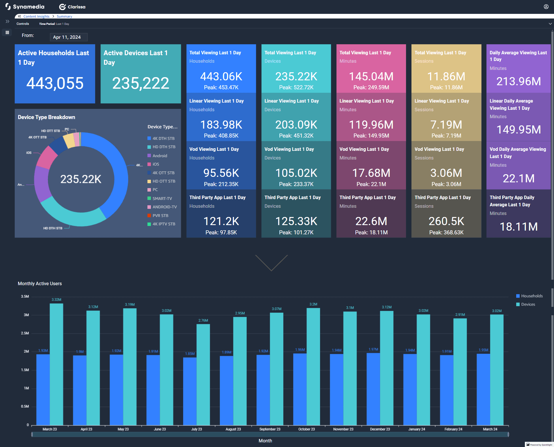
The dashboard provides Total, Peak, and Average metrics to give a well-rounded view of performance.
Peak captures the highest value for the metric during the selected time period.
Average represents the typical value for the metric across the chosen timeframe.
For shorter durations like "last day," Peak and Average will reflect the same value. Note: Total UI Time and Average UI Time is added in the metrics for Senza devices.
This dashboard provides a comprehensive view of content consumption metrics across devices, households, and session types.
Common Filters: All the metrics can be filtered using the common filters.
Device type (specific type of device) - Default selection is All
Session type (Linear, VoD and so on) - Default selection is All
Start Date and End Date - By default, date selection is for rolling 30 days. You can select your start and end date to review Reach and Engagement.
Device group (Main and Companion) - Default selection is All
Country – Default selection is All
Cohort – Devices that are activated in a specific month. For example: If 100 devices are activated in January 2025, on selecting January in Cohort filter, the dashboard displays data from all those devices for the month of Jan 2025; default selection is All.
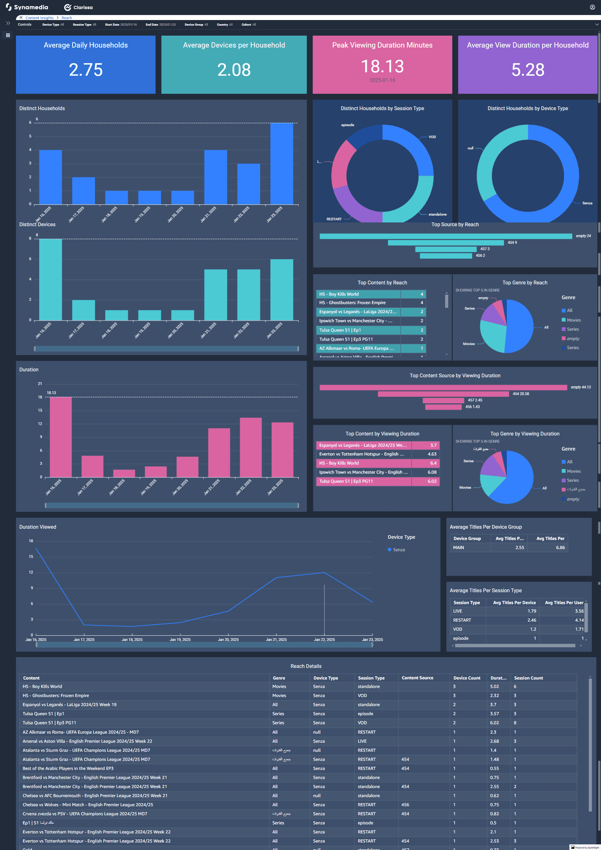
It includes key performance indicators such as:
Daily Metrics: Average daily households, devices per household, peak viewing duration minutes, and average view duration per household.
Content Reach: Top content, genres, and sources by reach, and viewing duration.
Device Insights: Breakdown of sessions and duration viewed by device types like Senza, 4K STB, Android, and Smart TV.
Trend Analysis: Time-series data for viewing durations and sessions over a specified period.
Content and Genre Details: Tables detailing content reach, genres, session types, and viewing habits.
This dashboard helps analyse audience engagement and optimize content strategies.
The Trends sheet is designed to facilitate the comparison of reach and duration between two distinct time periods, labelled as A and B.
The Trends sheet displays two tabs - Trends by month and Trend by dates.
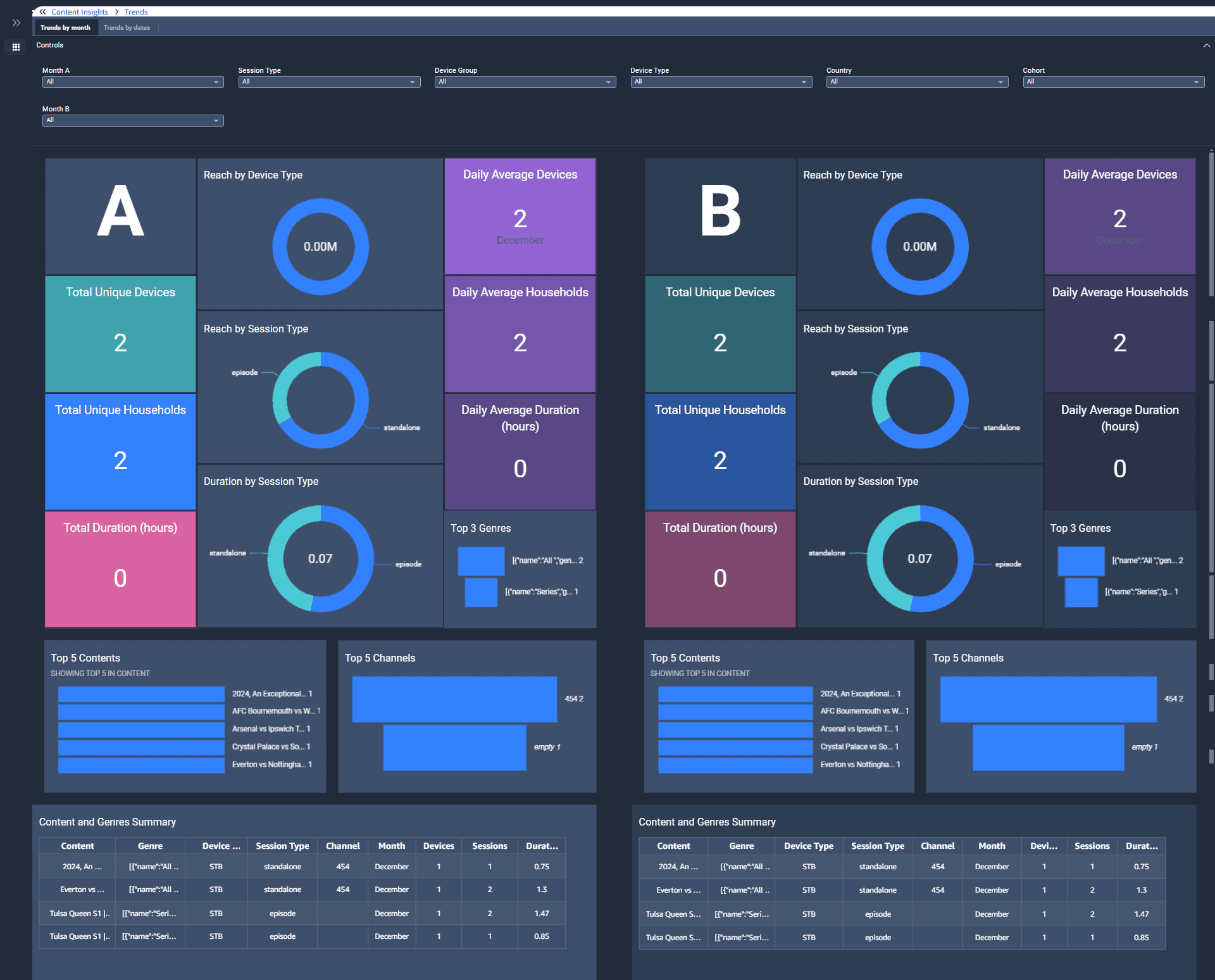
Common Filters: All the metrics can be filtered using the common filters.
The filters are applied to both A and B columns simultaneously.
Session type (Linear, VoD and so on) - Default selection is All
Device group (Main and Companion) - Default selection is All
Device type (specific type of device) - Default selection is All
Country – Default selection is All
Cohort – Devices that are activated in a specific month. For example: If 100 devices are activated in January 2025, on selecting January in Cohort filter, the dashboard displays data from all those devices for the month of Jan 2025; default selection is All.
This sheet focuses on channel performance and viewing patterns. One of the key metrics in the Value dashboard is channel importance. The Channel Importance metric assesses a channel's value to subscribers based on tuning frequency, recency, and minutes watched, identifying their most viewed channels. It helps evaluate the potential impact of losing a channel on subscriber churn.
The Value sheet displays two tabs – Best Performing and Worst Performing channels, highlighting the most successful and underperforming channels. The Channel Importance metric assesses a channel's value to subscribers based on tuning frequency, recency, and minutes watched, identifying their most viewed channels. It helps evaluate the potential impact of losing a channel on subscriber churn. Dropping low-importance channels poses minimal risk, while losing a favorite channel for a significant portion of subscribers could lead to higher attrition.
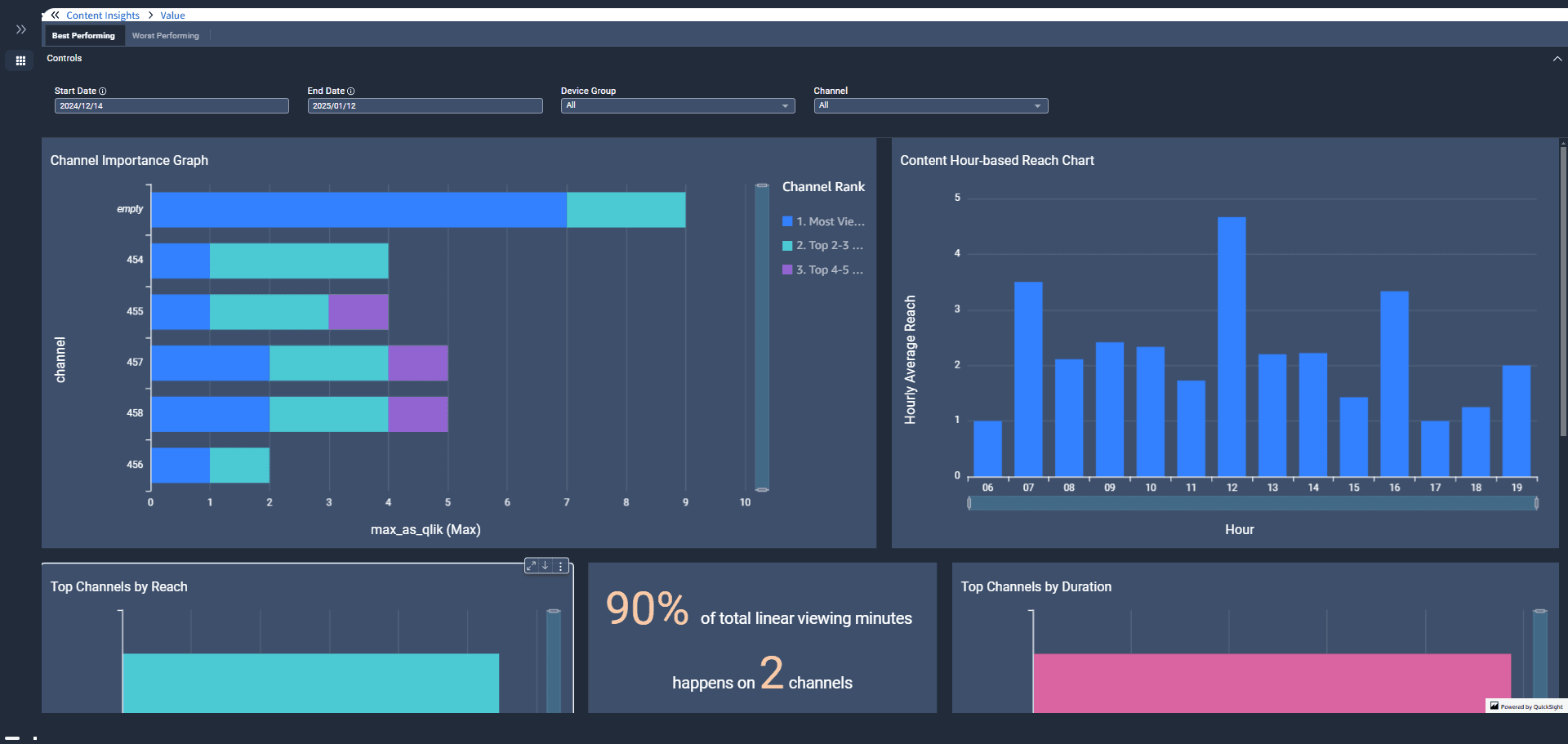
Common Filters: All the metrics can be filtered using the common filters.
Start Date and End Date - By default, date selection is for rolling 30 days. You can select your start and end date to review Reach and Engagement.
Device group (Main and Companion) - Default selection is All.
Channel – Default selection is All.