The Screens sheet aims to capture all the information that the Screens sheet provided in the former Clarissa dashboard tool. Currently, the only missing information in the Screens sheet is the link to Journeys. We will provide an update on Journeys shortly.
Filters for are provided for date selection, device group (Main, Companion, both), device type (specific type of device), session type and content genre. The filters help to refresh the numbers and charts across the dashboard.
The default filter selections include both Device Groups and all Session types.
The default date selection is for rolling 35 days. You can select your start and end date to review Reach and Engagement.
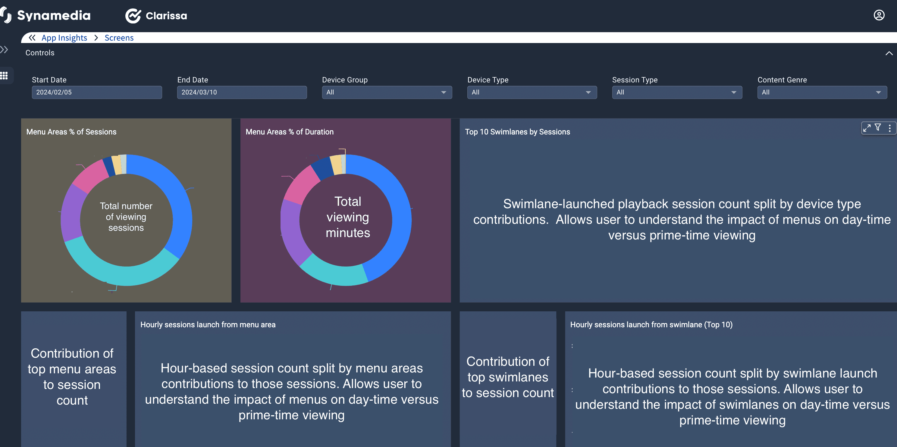
This entire dashboard has been structured into 2 halves – the left half focuses on the top menu areas and the right side focuses on swimlanes.
The two pie charts highlight the contribution of session counts or duration from each menu area in the playback sessions they facilitate.
When examining swimlanes, particularly across various device types with distinct aspect ratios/screen sizes, it is valuable to observe the impact of swimlane popularity based on device types. Hourly trends This is an hour-based session count split by either menu areas (left) or swimlane (right) contributions to those sessions. This chart allows users to understand the impact of menus or swimlanes on daytime versus prime time viewing and the likely demographic preferences this might indicate. Insight Trends A new introduction to new Clarissa dashboards is the creation of dynamic boxes that offer insights into the impact of UI on number the of number of viewing sessions.
The top X menu areas contribute to A% of viewing sessions – the purpose of X is to highlight the contribution that menu areas have on majority of viewing (A >50%). User interfaces that are simpler and cleaner are easier to navigate and insights like this one can help in deciding to phase out less frequently used menu areas.
The top Y swimlanes contribute to B% of viewing sessions - the purpose of Y is to show the contribution that swimlanes have on majority of viewing (B >50%). Considering the usual customer investment in recommendation services and manually curated swimlanes, comprehending Y could assist in contextualizing that investment.
The final part of the Screens sheet shows two tables that focus on the detailed breakdown of menu area or swimlane contributions to playback sessions by session count and viewing duration.
Next Article - Features Sheet User Guide
