A critical aspect to improving customer engagement and satisfaction is to make the process of finding content as seamless as possible. Knowing how subscribers navigate the UI can help service providers understand how to streamline journeys to content, highlight potentially lucrative but overlooked content, and develop more effective UI’s based on usage patterns.
The Apps Insights dashboards aim to deliver insights into how users navigate to content. We identify how many decisive journeys there are and how many people take the long way around, including how many of those navigational journeys result in content being watched.
The Apps Insights application comprises of three sheets that focus on different analysis areas:
Features
Journeys
Screens
This dashboard analyzes how users interact with different features, such as search, live pause, and the guide, providing insights into content discovery and user behavior.
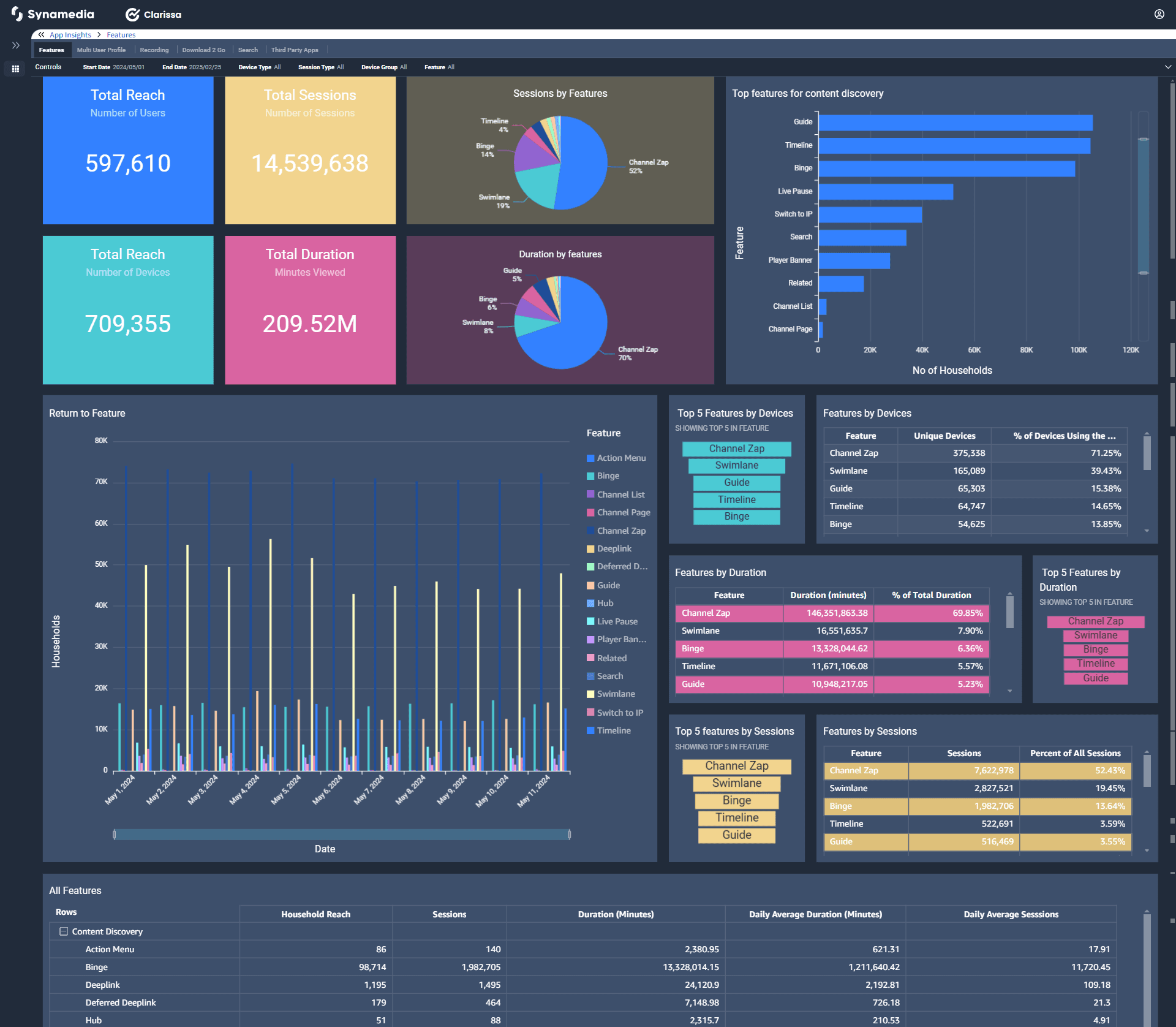
All the metrics can be filtered using the common filters.
Start Date and End Date - By default, date selection is for rolling 30 days. You can select your start and end date to review Reach and Engagement.
Device type (specific type of device) - Default selection is All
Session type (Linear, VoD and so on) - Default selection is All
Device group (Main and Companion) - Default selection is All
Feature (features to view the content) - Default selection is All
It includes key indicators such as:
Total Reach & Sessions – Tracks how many users engage with features and how frequently.
Top Features for Content Discovery – Highlights the most used discovery tools like search, timeline, and player banner.
Session & Duration Distribution – Displays how long users engage with different features.
Return to Feature – Number of households using the different features on day to day basis.
Feature Performance Across Devices – Shows which features are popular on different device types.
Table that focuses on the detailed breakdown of each feature by household reach, session count and session viewing duration.
In the Features sheet, by default the main tab is selected, that displays the details as mentioned above.
Following are the other tabs that display respective dashboards:
Multi User Profile - number of households creating a new profile and number of new profiles created.
Booking - useful data about the booked content.
Download 2 Go - details about the downloaded and viewed content.
Search - number of households and devices using the search feature.
Third Party Apps - number of households and devices using the third party apps, duration used, number of third party apps per household.
The various navigational journeys made to finalize the content for viewing is analyzed in this dashboard. This dashboard tracks different types of user journeys, such as decisive selections, browsing, binge-watching, and passive interactions. It helps in understanding how users navigate and engage with content.
The focus of this section is only on the data in the Data Warehouse needed to understand navigation behaviour across the different UIs. We have defined a journey as the series of interactions between two viewing sessions or to a viewing session from standby. Since no two people get to a channel in an identical fashion, we have classified all journeys into five categories, based on journey duration and number of UI interactions.
With these two parameters, we have defined five journey types:
Decisive journeys - These are short, direct journeys to content that indicate an intent of appointment to view.
Opportunity journeys - These are longer direct journeys. These represent an opportunity to improve the UI since they also indicate an appointment to view.
Browsing journeys - These are long journeys. Subscribers are taking time and browsing through the content catalogue to get to these. We typically see this is very high for Movie viewing.
Binge Watch - These journeys are VOD-only journeys with no interaction and users continue watching content, or the next asset in a VOD boxset or playlist.
Passive journeys - These journeys are linear-only sessions where users begin viewing after exiting from standby without any interaction.
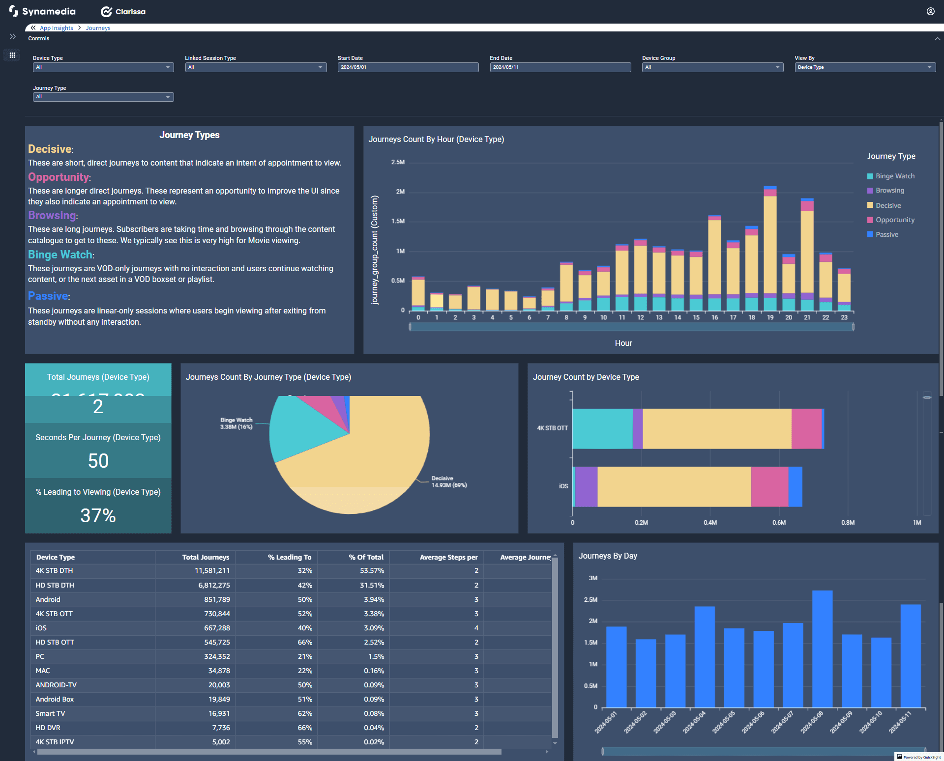
All the metrics can be filtered using the common filters.
Device type (specific type of device) - Default selection is All
Linked Session Type (Linear, Live Pause, Play from Start and so on) - Default selection is All
Start Date and End Date - By default, date selection is for rolling 30 days. You can select your start and end date to review Reach and Engagement.
Device group (Main and Companion) - Default selection is All
View By (Channel, Content, Device Type and so on) - Default selection is Device Type
Journey Type (Binge Watch, Browsing, Decisive and so on) - Default selection is All
Key Insights:
Journey Count by Hour (Device Type) – Shows the count of journey types for every hour.
Total Journeys, Steps per Journey, Seconds Per Journey, and % Leading to Viewing – Provides insights into the number of journeys, the complexity of navigation, duration of each journey and Tracks how many user journeys successfully lead to content consumption.
Journeys count by journey type and device type and the total number of journeys per day.
This dashboard focuses on how users interact with the UI screens, tracking engagement across menu areas and content swimlanes.
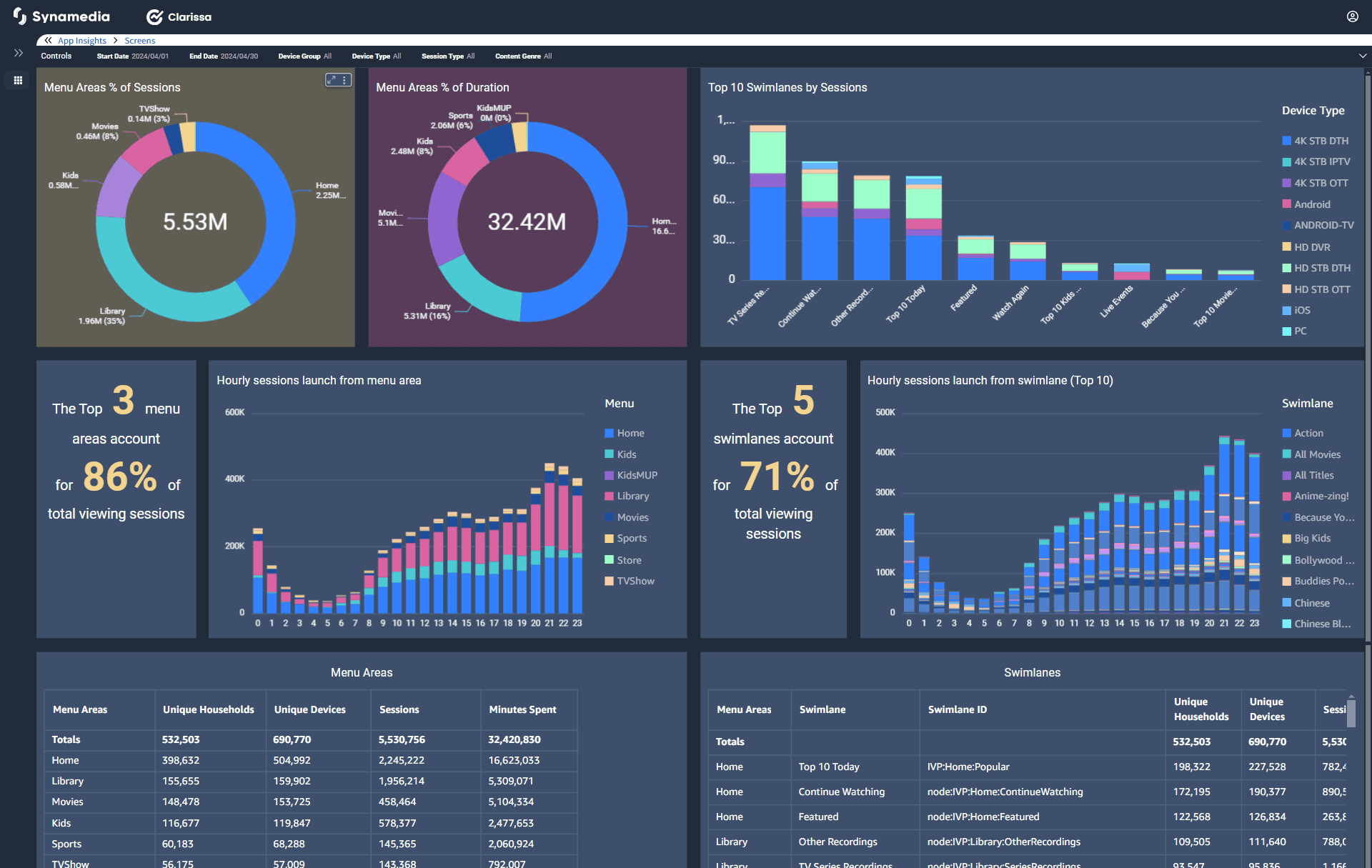
All the metrics can be filtered using the common filters.
Start Date and End Date - By default, date selection is for rolling 30 days. You can select your start and end date to review Reach and Engagement.
Device group (Main and Companion) - Default selection is All
Device type (specific type of device) - Default selection is All
Session Type (Linear, Live Pause, Play from Start and so on) - Default selection is All
Content Genre (Action, Comedy, Drama and so on) - Default selection is All
Key Insights:
Menu Area Engagement – Shows user interaction with different sections like Home, Library, and Kids.
Swimlane Performance – Identifies top swimlanes driving content engagement.
Hourly Usage Trends – Tracks peak interaction times for different menu sections.
Session & Duration Analysis – Measures time spent on different screens and sections.
